Philip Cornwel-Smith
12 Dec 2023
In this column, he discovers the story behind the revised logo for the Bangkok Metropolitan Authority.
Sometimes a sense of place can be expressed just through the shape of lettering. Just think of the I ♥ NY graphic by Milton Glaser, the art nouveau metro signs of Paris, or the vertical XXX of Amsterdam.
These days, many cities are rebranding. London adapted its street sign style as a logotype, Porto riffed on its blue/white tiles, and San Paolo captured its party cachet through a firework burst of colours. Melbourne spent half a million dollars to get a geometric ‘M’ that can be overlaid with other imagery. Amid this marketing contest, Bangkok Metropolitan Authority (BMA) has just refreshed its typeface and logo – though it hasn’t spent half a million dollars on what is its signature to the world.
Bangkok’s graphic image had become a mess. Yes, the city’s character is messy, too, but that’s not an excuse when visitors need consistency and residents could feel newfound pride in their city’s badge. There was no constant font, colour or composition for the logo and wording. There wasn’t a manual specifying how to reproduce the city’s graphics, which is a norm that any firm provides for its brands. Every promotion, like ‘Amazing Bangkok,’ ‘City of Life’ or the current ’Unfolding Bangkok,’ added yet more fonts, slogans and clutter. Bangkok has been in desperate need for what designers call an ‘identity system.’
Instead, Bangkok has wielded a ‘seniority system.’ Its insignia is based on a painting by a prince of a god on a flying elephant. It sacralises any surface it’s put on, proclaiming the authority of government, royalty and deity as part of a mythic narrative of Bangkok being the city built by angels for Indra. Under bureaucratic compliance, that was sufficient to work domestically for nearly a century. Under open competition with other world cities, it lacks reach with people oblivious to those status signals.
A total redesign was nixed, but a coherent refresh has proven possible. Under its energetic new governor, the BMA commissioned an ‘identity system’ by one of Thailand’s top design houses, Farmgroup, best known for running the Hotel Art Fair. The BMA also hired prominent Thai typographers to advise its team, so that it wouldn’t be just gatekeeping officials making professional design decisions.
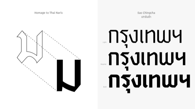
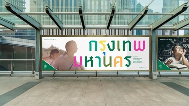
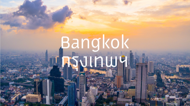
After four months of work, the BMA launched its new identity in November. They now issue manuals on the colours and contours of its proprietary new font, named Sao Ching Cha after the Giant Swing that faces City Hall. Anyone can pick from its wordmark options in Thai or English – abbreviated or spelled out – in black, white or a precise shade of green. Green is the hue of Bangkok’s presiding deity, Indra, who rides Erawan the elephant in the insignia. There’s even a swatch of matching colours that can brighten the BMA’s visual impact.
Sao Ching Cha is a tighter, squarer, more faceted adaptation of the Thai Naris font designed by Prince Naris in the early 20th century. Naris had revolutionised Thai lettering with a typeface that resembled strokes from a calligraphic ’parallel pen.’ The thick, flowing letterforms initially graced religious objects like monk’s fans. In tune with Art Deco and German Gothic, the style was adopted by officialdom in the nationalistic 1930s and 40s.
A graphic of the Chakri Maha Prasat Throne Hall had been the emblem of Phra Nakorn province until it was merged in 1972 with Thonburi province to form Krungthep Mahanakorn metropolis, the BMA. In 1973, the Fine Arts Department created its new emblem using Thai Naris font and inspired by a painting of Indra riding Erawan done by Prince Naris in 1923 for King Rama VI’s 60th birthday anniversary. The original is preserved by his heirs in Baan Plainern, which is opened to the public on Naris Day in April 29.
Some cities rework their historic emblems. In Norway, Oslo radically simplified its coat of arms into line art that matches the city’s slim custom typeface. It all integrates into a seamless ‘identity system’ in a way that Bangkok’s logotype cannot due to cultural rigidities. The designers would like to have rendered a fresh graphic from Naris’ original artwork, but the logo was registered in the government gazette and any change would require legal changes at the top. It remains sacrosanct.
That impasse is akin to the predicament the National Museum had long faced, where inaccurate labels couldn’t be updated due to the social seniority of the original curators. Eventually, the museum had to be completely overhauled and now revels in a magnificent redesign.
Unfortunately, the master reference of the BMA emblem held in the National Archive is not a clean original, but just a grainy A4 photocopy. It is so precious that the designers weren’t allowed to scan it, but could photograph the photocopy with their phone. Any finessing of the blotchy lines had to be limited to cleaning and sharpening. Some tweaks were permitted, some not. The result has been described by netizens and experts as slightly odd, but a coherent redraft simply wasn’t allowed. Perhaps one day, there might be a comprehensive revamp based on Prince Naris’ original instead of the 1973 copy.
This partial rebranding won’t get a grand launch. Instead, from new year 2024, the BMA will roll out its refreshed visual identity as each occasion arises. Bit by bit, sign by sign, sticker by sticker, Bangkok’s visual identity will become tidier, tighter and brighter.
This twice-monthly column, Very Thai, is syndicated by River Books, publisher of Philip Cornwel-Smith’s bestselling books Very Thai: Everyday Popular Culture and Very Bangkok: In the City of the Senses. The views expressed by the author of this column are his own and do not necessarily reflect the views of Koktail magazine.

Sign up for our newsletters to get all our top stories delivered.
© MEDIA MAGINATION 2022 ALL RIGHTS RESERVED.