Performances
Milli Serves Mango Sticky Rice Energy on Show Me the Money 12
Milli has made history as the first international female artist to reach ...


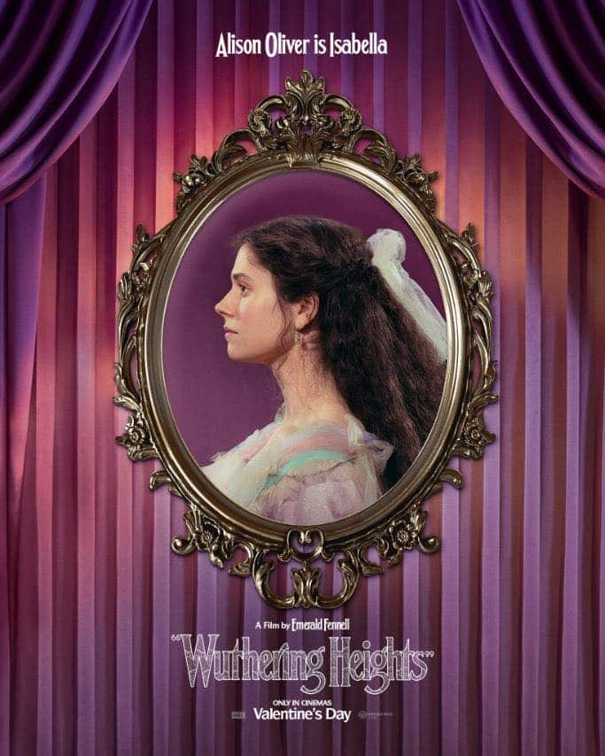
With Wuthering Heights now in cinemas, the colour work is impossible to ignore. The costumes are clearly crafted with care, but the real conversation sits within the film’s wider chromatic language. The film uses colour almost like coded emotion. It is more about exposing what the characters are feeling beneath the surface.
Emerald Fennell’s new Wuthering Heights does not simply recreate the 19th century. Instead it embraces bold, sometimes unexpected, palettes to evoke feeling rather than strict history. The interplay of set design, costume, lighting, makeup and surface texture are all part of this expressive visual language that often supersedes period authenticity. The design choices were made deliberately to tell us more about the character’s inner states. Production designer Suzie Davies worked closely with the director to give each location its own emotional signature, and to make the environments feel almost psychological.
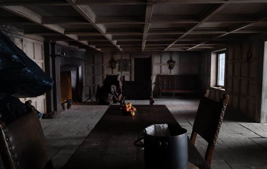
The home called Wuthering Heights itself is dominated by dark tones and heavy materials. These swamp-like neutrals and deep shadows suggest cold, confinement and emotional heaviness. The colours here do not welcome us, they press in on us.
In this way the film uses darkness to reflect the harshness of the setting and the inner bleakness associated with Heathcliff’s early life. The house does not offer warmth. It absorbs it. Characters appear swallowed by their surroundings, as though the house claims them.
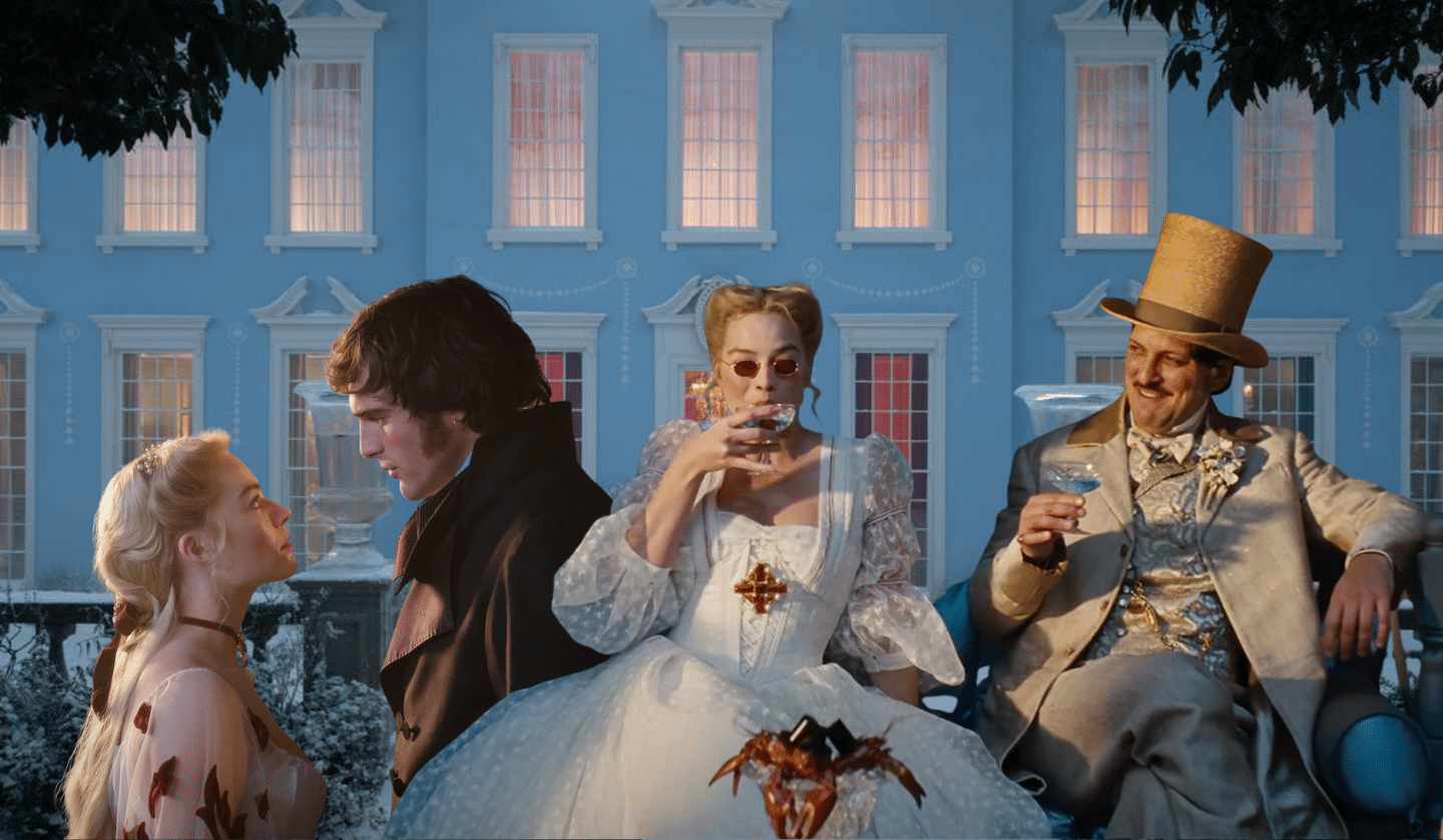
Red appears in key scenes and places, especially in rooms that are meant to feel heightened or intense. It signals passion and also a sense of something unsettled. The production uses bold red to give a sense of urgency, desire and tension in moments where emotions are strongest.
In scenes where Catherine’s clothing echoes the room’s tones, she appears fused with her environment. At other times the red separates her, marking her as disruptive within calmer spaces. The colour therefore functions both as connection and rupture.
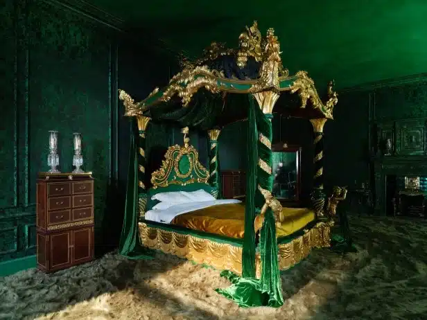

At Thrushcross Grange, the palette shifts. Green enters with cultivated surfaces and controlled decoration. The atmosphere is measured rather than raw. Where the Heights feel dense and airless, the Grange feels composed.
Green suggests care and refinement, but it also signals supervision. The comfort offered here is structured. It implies stability while enforcing behaviour. Costumes follow this discipline. Structured silhouettes and balanced tones echo the interior, reinforcing the sense that instinct has been adjusted to meet expectation. The space soothes, yet it also regulates.
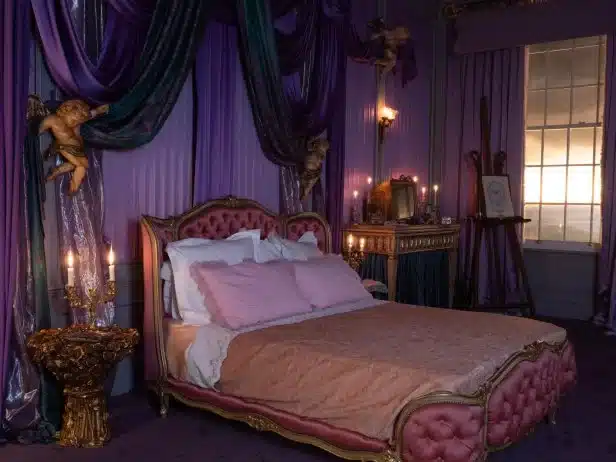
In Isabella’s private rooms, purple merges with cool blue tones. The palette appears rich at first glance, yet it carries tension beneath its surface.
Scenes of Isabella alone in her chamber emphasise pleated fabrics, ribbons and layered drapery in these hues. The colour suggests refinement and status, yet the density of fabric and tone creates compression. Purple implies elegance but here it reads as containment. Blue drains warmth from the space, introducing emotional distance. The room feels ornate yet constrained, the figure within it framed more than free.
Blue defines the Grange interiors, from the drawing room to the cooler tones that wash through the house itself. In scenes of controlled conversation between Catherine and Edgar, the blue surroundings create composure without closeness, keeping figures emotionally apart even when they share the frame.
In quieter moments by the windows or along the corridors, the same palette slows the atmosphere and drains warmth from the space. The house feels calm but detached, its cool surfaces reinforcing emotional distance.
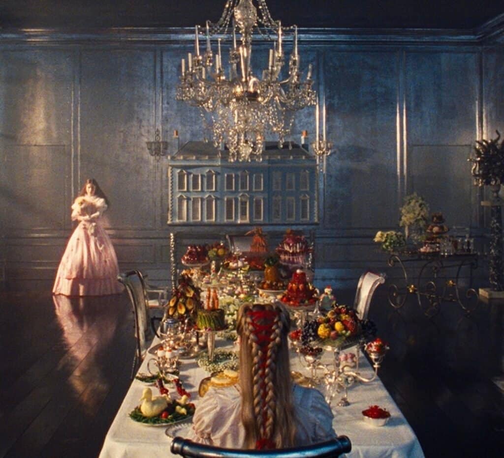
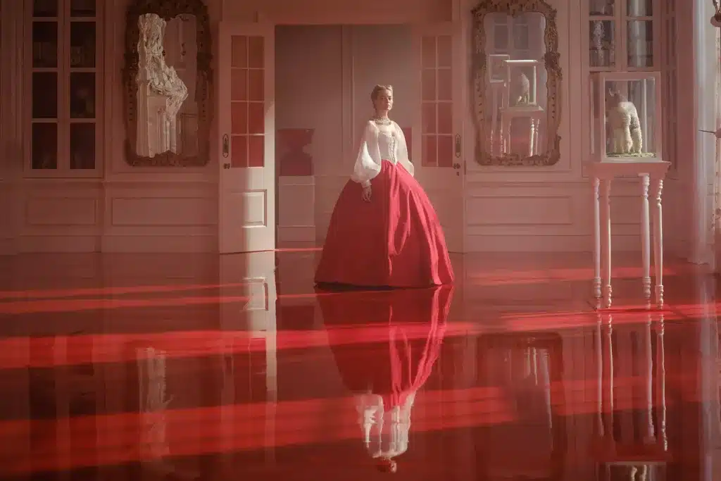
The Grange dining room is defined by white and silver surfaces that signal refinement at first glance, yet their brightness feels exacting.
Formal dinners unfold beneath pale walls and metallic finishes that rebound light sharply. Every gesture feels heightened. Silver surfaces and reflective textures create a sense of observation. Civility becomes performance under scrutiny. Against this clarity, darker clothing stands out at once, leaving little room for concealment. The palette demands visibility and turns civility into scrutiny.
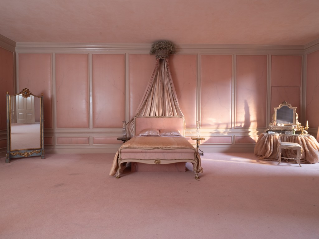
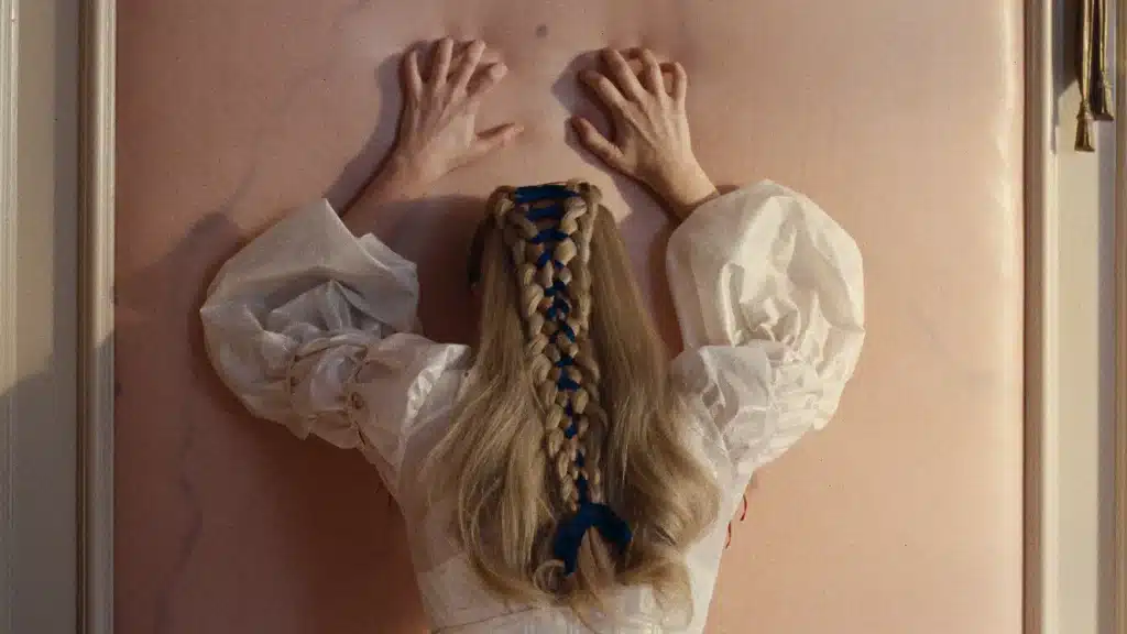
Catherine’s bedroom departs furthest from realism. Enlarged interpretations of skin tone envelop the walls so that surfaces resemble living matter more than plaster.
The effect is intimate yet faintly disturbing, as the line between body and architecture begins to narrow and vulnerability becomes spatial. Costumes dissolve into these surrounding hues, reducing separation between figure and setting, until Catherine seems absorbed into her own emotional interior.

Milli has made history as the first international female artist to reach ...

Keep your dining list current with 11 new Bangkok restaurant openings that ...
Another Thai floral goes international. Loewe just dropped its Paula’s Ibiza 2026 ...
Following the success of SCOPE Langsuan, one of Bangkok’s most desirable residences, ...

Wandering around the globe, try out the signature tastes of cultures across ...
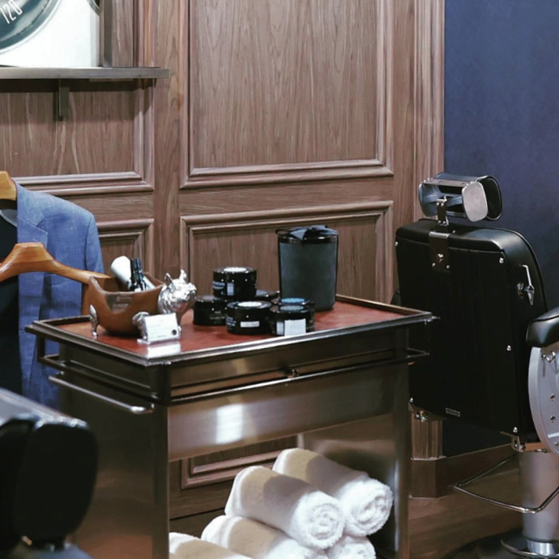
These top 5 barber shops in Bangkok are where gentlemen can elevate ...
Wee use cookies to deliver your best experience on our website. By using our website, you consent to our cookies in accordance with our cookies policy and privacy policy