Food & Drink
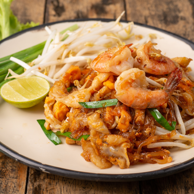
Foodie’s Bucket List: 24 Iconic Foods to Try Before You Die
Wandering around the globe, try out the signature tastes of cultures across ...


Election posters clutter every street. Parties need us to memorise their number on the ballot. Candidates emblazon their name and face. Many use gimmicks, from the Green Party’s pets and Kla Tham’s delivery rider to Thai Sang Thai’s crocodile wrestler. Another subtler detail hints at deeper values: typeface.

“It feels like campaign signs are shouting in my face. What are these signs talking about?”
posted ‘In Font Of’, a Facebook group that’s been gathering typography used in the 2026 General Election.
“Let’s examine the wording and the fonts. See if you can read between the lines. The colours, font, image, identity and beliefs of the party all have to go together.”

Type is a hot topic. Bangkok Design Week focused on classic Thai brand labels. A group exhibition on artistic Thai lettering, Thaipography, is being run by MOCA until March 22 at Four Seasons Art Space. WeVis and the Commoner Museum held an exhibition at Chulalongkorn University’s Faculty of Political Science about Thai political leaflets since the 1960s, called: “Elect Me – Please Choose Me!”
This political font project hasn’t come out of nowhere. The Commoner Museum has displayed its collection of protest materials. The 10th Bangkok Identity and Typography Symposium (BITS), featured a book on the fonts created by the 2020-21 Ratsadorn protests, Mob Type, and a talk by me about the history of Thai political lettering, ‘Typecast by Typeface.’

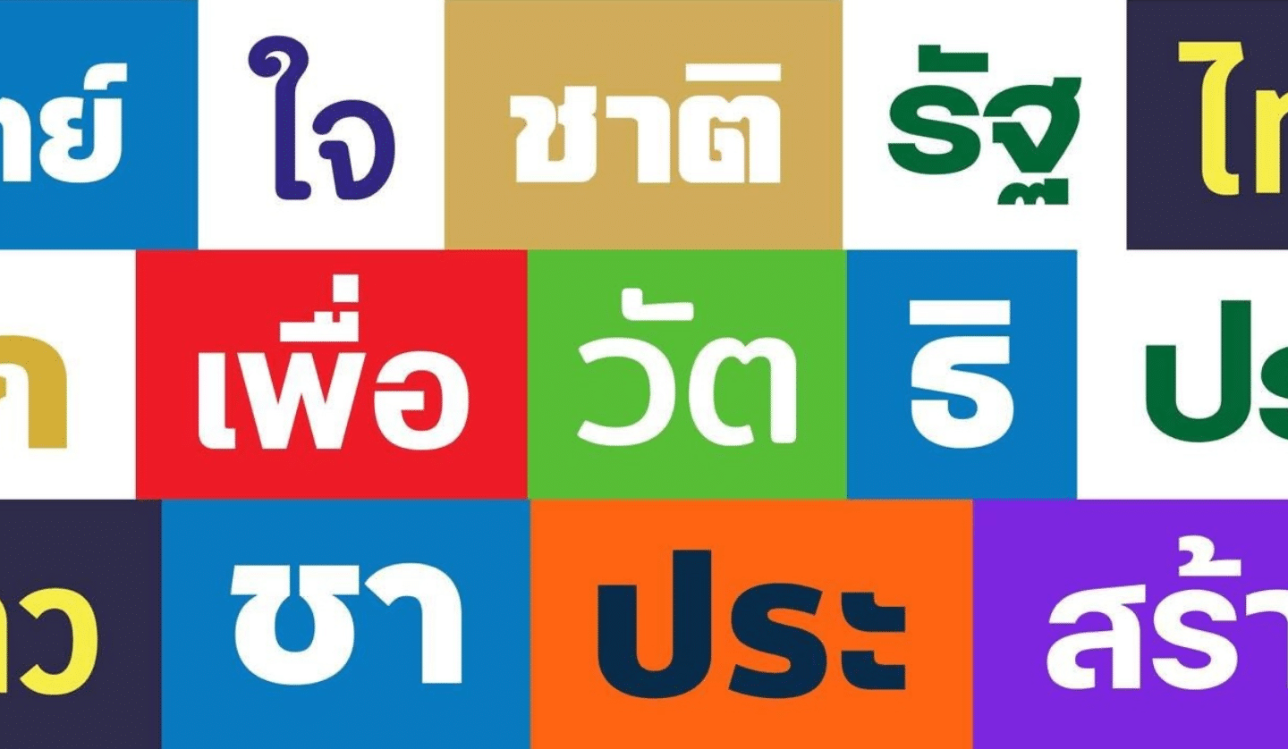
Typography seems nerdy, but it embodies beliefs. Language and script are core to cultural identity. Thai has two competing formats: looped and unlooped, which reflect history and ignite debate. The Ramkhamhaeng Stone inscriptions, in the earliest Thai script, declare Thai dominion. Angular and unlooped, they were shaped by how stone gets chiselled. Loops came during the Ayutthaya era, when curves enabled palm leaf to be inscribed without splitting. A viral video contrasts the prime minister’s handwriting with the precisely looped aksorn liam letterforms taught in schools. Nativists complain about Thai fonts being restyled to match foreign ones. Font choice may position you on a scale of very Thai to unThai.

“Typography is important in representing national uniqueness,”
declared Pairoj Teeraprapa, a Silpathorn Award-winner known as Roj Siamruay for his brand of retro typographic products.
“We have our own nation and our own letters. Thai fonts indicate Thainess.”
For decades, array Thai party logos and fonts on the political spectrum and the further right they’ve tended to get more looped and curved; the further left they’ve typically got more angled and pointy. Cultural exceptionalists prize the loops as a Thai trait, echoing the curlicues of magical yantra diagrams. Loops today appear fully in conservative parties like United Thai Nation (UTN), truncated like serifs in the rounded strokes of Phumjai Thai (Thai Pride) or abstracted into curly tails for Thai Phakdi (Loyal Thai).
A new font, DB SuttruPhai (Defeated Enemy), marks the Thai-Cambodian border conflict. Its thick, rounded lines draw from text on old fortresses, which again reflected limitations of the medium, in that case stucco.

In the nationalist 1920s-40s, display fonts for signage were invented by thickening spindly Thai strokes and filling the loops into blobs. That bulbous font style, called Poang (boastful), triggers images of that era’s advertising and official posters propagating the ‘Cultural Mandates’ of Thainess.
Since the 1990s, those bulbous fonts became a signature of the retro revival. New fonts in that retro style were pioneered by Roj Siamruay, who’s famed for the film poster for Fah Talai Jone. He also created the font Fah Thai for anti-Thaksin protests. When Free Siam, a group of exiles from the 2014 coup, used SR FahTalaiJone, Roj demanded they stop using the font, despite having made it free to use.
Today’s People’s Party and others towards the centre and left use loopless fonts, which evoke the modernist feel of sans-serif fonts in the West. Minimal, chunky and suited to display, they use deft conturing to remain readable. Yet this year, loopless fonts are dominating more than ever, as they catch the eye while passing.

“Fonts can express political values, but not in a romantic way. The shape of a typeface rarely ‘contains’ ideology,”
explains Anuthin Wongsunkakon of the leading type foundry Cadson Demak.
“For parties and election campaigns, typography has a different purpose from protest visuals. It is not primarily self-expression or emotional release. It is communication. Most parties end up using loopless Thai simply because it looks instantly contemporary, not because looped Thai cannot be modern. Loopless styles are easier to deploy under production pressure.”

Kla Tham Party posters utilised the hexagonal looped headline font so familiar from Thai tabloid newspapers. But it’s joined on posters by several other typefaces. Mixing fonts has long been the norm in Thai media and websites, though that’s changing.
Cadson Demak is known for making Thai versions of famous fonts like Helvetica or Neue Frutiger Thai, the latter coming with or without loops. They tailor proprietary font families that can maintain an organisation’s house style across Thai and various foreign scripts.
“Many Thai political parties still default to whatever free font is convenient, with no effective typographic strategy,”
Anuthin points out.
“Whether they have a typographic system signals management skill, seriousness, and long-term thinking. That is not merely aesthetic. Their typography ends up saying something truthful about the kind of future they are capable of building.”
In Font Of noted that
“from many hundreds of political parties in three general elections in 2019, 2023 and 2026, only three political parties built their own ‘custom font.’ It’s a matter of having more corporate identity, which is not cheap.”
One outlier, Chart Thai Pattana, adopted the custom font Sri Mork, commissioned in 2017 for Suphanburi Football Club, which is linked to that party. Its chunky curves evoke the contours of its mascot, the elephant.

Thaksin Shinawatra had pioneered the commissioning of a custom font for his new kind of mass party, Thai Rak Thai. Each time his parties got banned and reconstituted, that font continuity ensured visual recognition. Proving how font and politics align, the rightwards shift of Thaksinite parties, Thai Raksa Chart and then Pheu Thai, was heralded by their switch from spiky, bladed uprights to loops, just before allying with establishment rivals.
In a very Thai twist, reputedly a fortune teller had advised that it was unlucky to behead Thai letters! Loops come in two kinds: ‘head loops’ that start a letterform and ’knot loops’ that redirect the line mid-stroke. The heads give Thai letters their personality, but that doesn’t appeal to all Thais.
As with other uniformities in Thai life, there are official National Fonts. Coded by NECTEC, they standardise the printing of the country’s standardised central Thai dialect. These fonts became so familiar that they remain legible even when disfigured.

A documentary by Pen-ek Ratanaruang, Paradoxocracy, audaciously recounted Thai political history to highlight its awkward gaps. Its poster by Surat Tomomsak evoked the censorship by erasing the middle of the national font, Sarabun, yet the text could still be read.
During the Ratsadorn protests, the anonymous collective Prachathipatype (‘Democratype’) designed the font Hua Hai (Headless) by decapitating TH Sarabun New. Shorn of all ‘head loops’, its crippled form remains readable but ineffective, to convey how voters’ heads get disregarded.
Hua Hai is one of the fonts explained in Mob Type. Available in both Thai and Korean/English editions, the book is well-illustrated and won a DEmark Award for its design. One tall, fat font, Thang Maa Lai, looks like a zebra crossing and is intended for words to be walked on – an emphatic act in this hierarchical culture.

Prachathipatype wrote the book, but it also includes fonts by other designers. Puengboon Jaiyen devised a handwritten style resembling punk fonts in the West. Thai script’s curves turned into slashes, its loops negated into crosses. Anonymously coded into the digital font FC Rebel, it viscerally communicates the protestors’ anger at the entire system.

Some mob fonts have become widely used in mainstream media, including Hua Hai. Resembling newspaper gothic black-letter mastheads, KhanaRatsadorn was recreated from the wording of the plaque that commemorated the People’s Party declaration on 24 June 1932 to mark the end of absolutism. It was replaced anonymously by a nationalist plaque, but the ’Streisand Effect’ sees the KhanaRatsadorn font appear on many books and posters. The protest group Thalu Fah evolved their brand image from their zig-zaggy thunderbolt ‘word marks’, jutting at explosive angles. Bursting with energy, similar word marks are now used by the BMA.

The contested terrain of loops, loopless, National Fonts, Mob Type and inkjet vinyl election posters seems dominated by values and identity. Yet they’re driven by technology, from stone to leaf to stucco. Thai typography came from hot metal printing and typewriter keys. Now computers enable fresh possibilities, though limited by screen legibility. As technology evolves – with projections and drone-assembled words in the sky – typography both mirrors and moulds how we feel about politics.
This periodic column, Very Thai, is syndicated by River Books, publisher of Philip Cornwel-Smith’s bestselling books Very Thai: Everyday Popular Culture and Very Bangkok: In the City of the Senses.
The views expressed by the author of this column are his own and do not necessarily reflect the views of Koktail magazine.
Wandering around the globe, try out the signature tastes of cultures across ...
Check out 14 casual dining restaurants that make effortless vibes seem natural ...
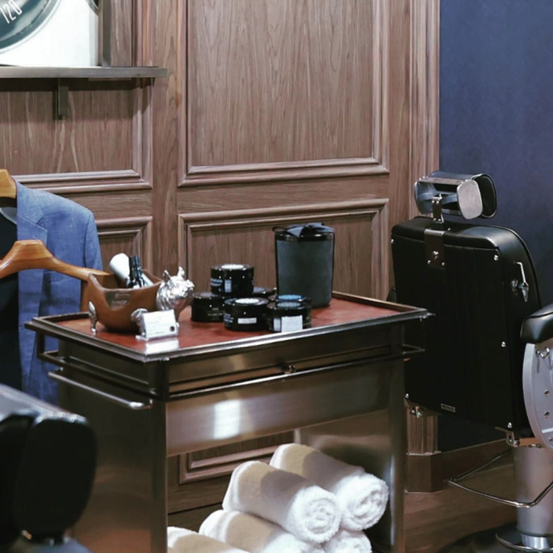
These top 5 barber shops in Bangkok are where gentlemen can elevate ...

A detailed guide to hiking the Naga Cave, combining physical challenges with ...

Bangkok Planetarium’s “To the New Legacy” event will be held on 28 ...
Gawdland has the world gagging, making history as the first Asian queen ...
Wee use cookies to deliver your best experience on our website. By using our website, you consent to our cookies in accordance with our cookies policy and privacy policy